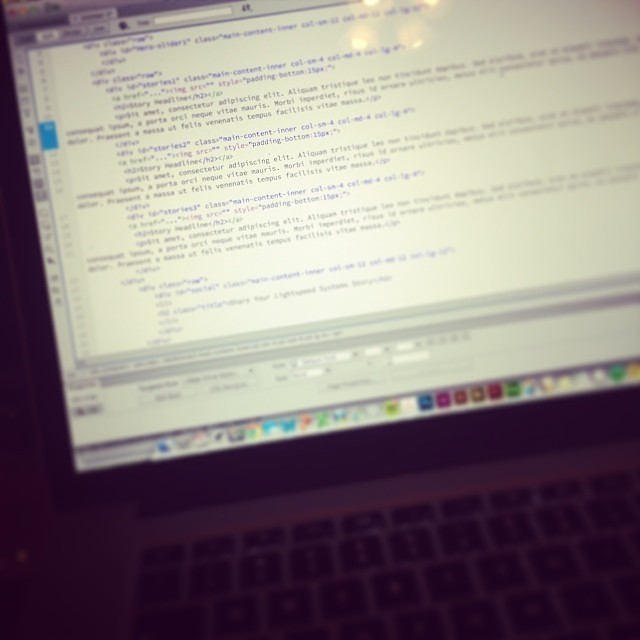
Responsive design, in the simplest of terms is a design format for digital content that allows content to flow to different devices without writing separate code for each device. You only need to write code for a website once. This helps a designer tremendously by saving time and keeping within a visual design scope on a project.
Structure—most of the time, responsive design is based off of Bootstrap. It’s easy to understand, mockup, and implement. However developers will sometimes have their own custom grid structure. It really just depends on how a developer’s workflow dictates what needs to be set up.
I had mentioned on twitter that I was figuring out mobile versions for a responsive site when I got this reply:
“Surely responsive sites don’t have a mobile version” – @davidbluton
He brought up a good point, which most clients don’t understand. While responsive sites make it easier to be viewed on a mobile version, you still need to call out what content is shown on different sizes. With a bootstrap structure you have three break points large (computer monitor), medium (tablet size), and small (smart phone devices). What this means is that there is a great deal of thought, which goes into how content is displayed to the user on multiple platforms. In this particular instance I was working on a site that had massive amounts of textual information, content and design elements going everywhere. This is where responsive coding is key. Even while you have columns of text, graphical elements, you can choose what you want to show at each size by just changing the single line of code for small or medium content.
This allows the designer to control the UI/UX (user interface / user experience) so that they have a delightful experience on smaller devices but only coding once. Someone on a smart phone may not want nor need to scroll through tons of content, whereas someone on a tablet may want to have a more native experience.
Responsive design is a way to code and make life simpler, however, if you do not plan out a tablet and/or mobile versions before coding, you could be in for an information overloaded user disaster.

