Various Logos
Creative Direction – Branding
Tools: Notability, iPad, PC Desktop, Mac, & Illustrator
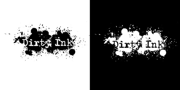
Dirty Ink: startup company focusing on erotic artwork. Their words include grunge, dark, & splatter. Taking the rough feel of ink splatter and combining it with a distorted typewriter font I wanted to leave the viewer think the letters are bleeding through the ink or vice versa.
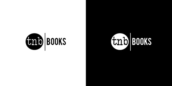
The Nervous Breakdown (TNB) announced that they were extending their brand to include an imprint publishing company. They wanted their existing logo to be able to extend into the imprint as well as have the option of other offshoots of the brand.
The original circle TNB logo I couldn’t touch, plain and simple. After several rushed versions, this was the final choice of the brand owner. He needed it to be read at small fonts as some of the imprint spines would be thin but able to mesh with the eclectic nature of the books he’d publish.
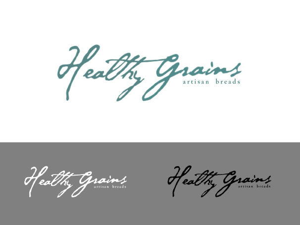
Healthy Grains-Artisan Bread was a company birthed from the worry of HFCS (corn sugar) and the idea that there needs to be more hand in the handmade process. I wanted to focus on the handmade aspect of their breads. Ineeded the rugged to help ground the font with the natural feeling they wanted.However, the peacock blue helps to underscore the whimsical and playfulness,which they embody.
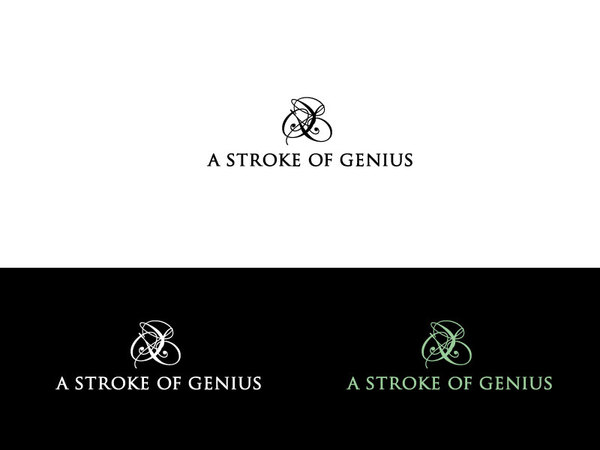
A stroke of Genius: When Lindsay, the owner of A Stroke of Genius, came to me she had a very clear vision of what she wanted. She used words like, classy,sophisticated, & high end. Lindsay had a new market and a tool kit of greenproducts to showcase.
I started with a strong font, Trojan Pro. The subtle curves brought a touch of traditional to the otherwise modern logo. Playing with the idea of strokes of paint yet wanting to incorporate the S and G I turned to an ornate script which mimics the thick and thins of a brush. The brush strokes brings the viewer back to the company name. Once the design was set we moved to color. Lindsay wanted something earthy. Her preferences included brown, blue and green. We decided on green as the new paint line she carried was a green solution. The soft pastel green helped feminize the logo to represent the woman owned company and at the same time appeal to her largest market, women.
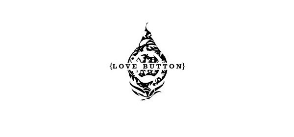
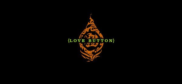
Love Button: Love Button was looking for an brand that symbolized urban chic with an eco-friendly consciousness. They wanted a few things within their logo that helped to incorporate their core beliefs and help to brand the company as earth friendly and hip. Two main ingredients were a button and a peacock feather. The main shape of the logo is a peacock feather divided in half by the company name. Hidden within the Victorian chic decoration is a button, half above the company and half below. The main colors were provided byLove Button: yellow green, burnt orange, and peacock blue. Other colors were suggested but I focused on these as they yelled eco friendly. In the end the process yielded a logo and branding that clearly states urban chic with an eco-friendly consciousness